- Select any of the columns by clicking on its title label
- Right click and invoke the “Set Values” dialog box
- Click on the little arrow to the bottom right (“Show Scripts”)
- In the “Before Formula Scripts” text box, type in the following:
// set your reference paramters
aRef = 10;
aCorrection = 0.01;
// loop over columns – say from column 2 to column 25 – you may need to start at column 2
// since column 1 usually holds the data corresponding to the independent variable
loop(i, 2, 25) {
wcol(i) /= aRef;
wcol(i) += aCorrection;
}- Click “Apply” or “OK”
Voila!
Origin is a “professional data analysis and graphing software for sicnetists and engineers”. More often than not, I find myself importing tons of data into worksheets. Most of the time, I would be comparing analytical (yes, some folks on this planet still do analytical work) and numerical data. Without loss of generality, most analytical solutions produce dimensionless data which will eventually end up being compared to numerical or experimental results. Of course, the numerical or experimental results need to be normalized accordingly. Bottom line, you have to go through every column of external data and do what needs to be done: divide, multiply, subtract etc…
In Origin, once you have some values in a column, you can right click on that column and select “Set Column Values” and enter some formula (e.g. Col(A) = Col(A)*10 + 2). The brute force approach is to go over every column, and type in the formula over and over again. So for Column B, you’ll have Col(B) = Col(B)*10 + 2 and so on.
Fortunately, Origin is amazingly modular and allows you to put in your formulas as a script. So here’s the idea: How about writing a script that loops over all the desired columns and sets the values accordingly?
The nice thing about this is that you can use the usual C operations: *=, /=, +=, and –=.
For online video tutorials and goodies related to Origin, check the OriginLab Website.
Enjoy programming!
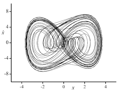
Update: A couple of graphs made using Origin to illustrate the quality of the resulting graphs. Note that the default graph template used by Origin may look just like an excel graph. You will have to customize your graph to match the look that you are looking for, and of course, reuse the template you have created.
Cite as:
Saad, T. "Setting Column Values in Origin – the Programmers Way!".
Weblog entry from
Please Make A Note.
https://pleasemakeanote.blogspot.com/2009/02/setting-column-values-in-origin.html


I was recently involved with getting a site license for Origin at my University but haven't had much time to play with it.
ReplyDeleteSo, thanks for this info - it helps show me that it is actually pretty powerful and might be worth investing more time with. I recently discovered that it contains most (all?) of the NAG C libraries which is pretty cool too.
Out of interest - what do you use Origin for that you can't do with Mathematica?
Hi Mike,
ReplyDeletegood to hear from you.
I literally use Origin for all my work - whether be it internal reports or publications.
The look and quality of the graphs is quite impressive, provided you customize your template accordingly. For illustration, I have updated the post with two graphs generated by Origin (results pertaining to Ueda's Oscillator).
While you can do pretty much everything you want with Mathematica, the customization options for its plots doesn't match that of Origin. Therefore, I use Mathematica plots to probe what needs to be plotted. Once I make up my mind, I export the data to Origin.
I will soon post the customization that I use for Origin.
I agree, they are nice looking plots.
ReplyDeleteLots of new users of Mathematica, MATLAB etc ask how to produce 'publication quality' plots all the time. Quite frankly it baffles me why the respective vendors don't provide function templates that do exactly that (although it might be down to the fact that no one can agree as to what counts as 'publication quality').
I'm looking forward to seeing your Origin customizations - I imagine that they would be useful to a lot of people.
Best wishes,
Mike
Hi Mike,
ReplyDeleteThanks for your comments. Your feedback is always greatly appreciated.
Here are my thoughts on this: although there is no standard for what counts as publication quality figures, one is always able to detect a high quality one. It is indeed up to the researcher to put a high quality graph together.
To achieve this, the software has to offer the user a wide range of customization tools to produce what they perceive as a high quality figure. Then, this becomes a new project by itself which I think Mathematica and the rest of the guys are not willing to venture into.
Incredible you are the most stunning designer I've ever seen in my whole life sweetheart!
ReplyDelete